"...ignoring the potential benefits of setting and following a defined social media marketing strategy is downright negligent."
http://www.singlegrain.com/blog/6-steps-to-creating-an-effective-social-media-strategy/
Monday, December 24, 2012
Saturday, December 22, 2012
Saturday, December 1, 2012
Tuesday, September 18, 2012
6 Trends in Social Media Marketing
Here's a great presentation about the trends in social media marketing:
http://www.slideshare.net/KyleLacy/6-trends-and-tactics-changing-marketing-and-social-media
Note the reasons (about slide 58) that people unLike a brand's FB page!
http://www.slideshare.net/KyleLacy/6-trends-and-tactics-changing-marketing-and-social-media
Note the reasons (about slide 58) that people unLike a brand's FB page!
Friday, September 7, 2012
How Not To #2: Run A Social Media Campaign
The next in our series of 'How Not To' discusses how not to run a social media campaign. Social Media Marketing is a bandwagon, and some people get on just for the ride. Twitter can be a good vehicle in the fleet of a company's social media marketing, if used well. Or it can be A Lemon.
Supporting your customers needs is critical. Phone, e-mail live website chat: all tools in the armoury of a business. And Twitter is another such 'weapon', allowing for one-on-one contact with a customer, or potential customer. So bravo that at least one bank in Dominica is using it: Scotia Bank (and sorry for mixing my metaphors!). And yet...
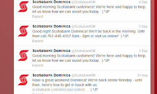
And yet, two tweets a day, signing in, and signing out, gets just a little repetitive, month in, month out. I'd certainly hate to follow ScotiaBankDM! I understand the point is that they're there for me if I need it, poised to answer my every banking need. But still.
Come on guys, let's have a little well colour or personality to the tweets once in a while. How about 'It's a beautiful day here in Dominica!', or a 'Gosh the sea is rough outside Scotia Bank here in #Dominica'.
Perhaps the team of tweeters shown in the profile are nothing but robots; they're more than likely not even in Dominica, which is part of the problem. You'll get few returns on your social media investment if all you do is go through the motions; just a little enthusiasm - love of your brand or product - is needed.
Thursday, September 6, 2012
A Content Planning Strategy
You website's content is key to its success, but isn't always given the treatment it should be. Here's a great article can can kick-start your content review.
Friday, May 18, 2012
Dominica's Smartphone App

The app comes with a mobile-ready website at DestinationDominica.com
You can get the app from Google Play app market by scanning this QR code below:

Friday, May 11, 2012
Thursday, April 26, 2012
Ever Wondered if a Particular Website was a Scam?
Here's a safe (and free) way to find out if that website address someone sent you is harmful...
Bio: Wendy Walsh is a Director at Delphis Ltd, e-marketing & social media consultants. Connect with Wendy on Google +
UrlVoid.comUrlvoid.com is a free service that lets you scan a website address using several "web reputation engines" to determine if the website is dangerous. Just type in the web address (or copy and paste) and let it run the risk for you.
Bio: Wendy Walsh is a Director at Delphis Ltd, e-marketing & social media consultants. Connect with Wendy on Google +
Thursday, April 19, 2012
A guide to going mobile for hoteliers
Some great advice on how hoteliers can get the most out of mobile.
- Mobile websites versus mobile apps
- Device detection is key
- Optimizing the booking channel
- Marketing mobile
- Create brand awareness
READ THE ARTICLE...
A guide to going mobile for hoteliers
Friday, March 16, 2012
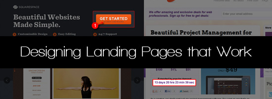
Designing Landing Pages That Work
Sent to you by Steve Mc via Google Reader:
via Six Revisions by Jacob Gube on 3/16/12
Having knowledge on how to create an effective landing page can increase the number of site visitors that take the desired action of the web page. Lets discuss factors and considerations that can lead to a better landing page design.
What is a Landing Page?
Before we begin our discussion, it's worth quickly defining what a landing page is.
- From a web development/technical standpoint: A landing page consists of the same basic elements as any other web page (HTML, CSS, content copy, images, videos, etc.)
- From a business standpoint: It's a web page that asks users to perform a specific task such as purchasing something or subscribing to an email mailing list.
- From a user standpoint: It's a page they see after clicking on a hyperlink on another site (Google searches, a URL contained in a tweet, banner ad, etc).
Three popular reasons for creating a landing page are:
- Get people to sign up (whether it's for an account, a newsletter, etc.)
- Sell a specific product in a specific situation (like a sale or a promotion)
- Get people to download and install software
Guidelines to an Effective Landing Page Design
Let's talk about important components and factors of a good landing page design.
Call to Action
A call to action clearly asks and compels the user to take a specific, desired action. An example of a call to action is "Subscribe to our mailing list". Oftentimes the call to action requires the user to click on a web page element (such as a hyperlink or a button) or to fill out a web form.
Tips:
- Be clear. Be direct by succinctly stating what action the user should take and what the result of the action will be.
- Limit the number of call to actions. By only having a few call to actions, you can focus on getting the user to take the preferred action you want as quickly as possible.
- Use buttons for actions requiring a click. Buttons are conventional UI controls that users will know is clickable. Additionally, when designed well, it can draw attention to your call to action.
- Have supporting information ready and close by. Users need to be compelled to take action, make sure you have things on the landing page that encourage them to perform your desired action.
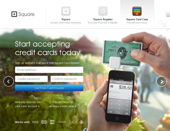
The landing page of Square is a perfect example of a good call to action. (The call to action is to sign up for a Square account.) They clearly state that they would like you to sign up and, as a reward, they will give you a free Square Card Reader.
Headline
An effective landing page has to have a power headline. The headline sends the main message of what to expect in the landing page and it lets the visitor know that they're in the right place.
Headlines have only one task: to entice the site visitor to stay on the landing page. That's the main goal to have in mind.
When crafting your headline, ask yourself: Is this headline interesting enough and does it make the visitor want to keep reading?
Tips:
- Keep your headline short and direct. Don't waste the user's time, give the user an idea of what they can achieve on the landing page as quickly as possible.
- Design to grab the viewer's attention. Use a large font and place your headline prominently on the page. The headline should be at the top of the web page, where Internet users expect it to be.
- Consider using relevant keywords. Use keywords and phrases that a search engine user might use to find your page. Use an HTML heading element (such as
<h1>or<h2>) to help search engines index the content of the page better.
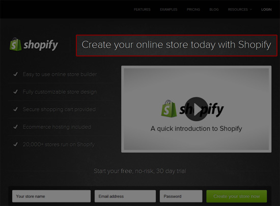
The Shopify landing page displays a good headline. The copy is short and gives the reader a quick overview of what the service is. It's designed using a big font and is placed in a prominent location so that it quickly grabs the user's attention. The use of the key phrase "online store" in the headline may help in Shopify's SEO efforts.
Simplicity
Landing pages should be simple. If the landing page is too complex, the site visitor might be discouraged to remain on the page. The more complex landing pages are, the smaller the chance users will go through with the desired action. The message needs to be clear and only the essential stuff should be included.
Tips:
- Every element on the page should encourage the user to take your desired action. Use the concept of Reductionism to help you eliminate needless items and copy.
- Have only one primary call to action. Keep your landing page's objective simple. Pick a task you would like the user to take, such as downloading your software or signing up for your mailing list, and limit it to just that. Any additional call to action should reinforce your primary call to action.
- Use ample amounts of whitespace. If things are too cramped together, it might visually intimidate the site visitor.
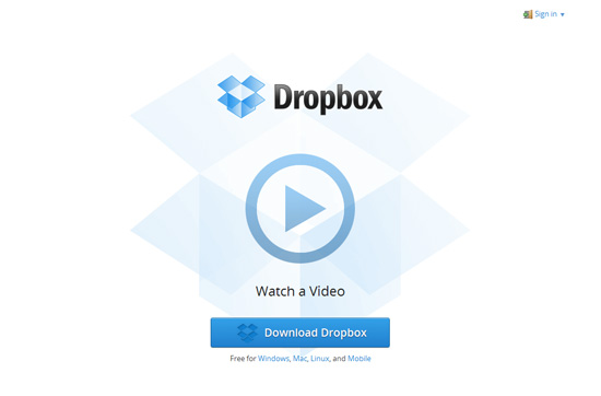
The Dropbox landing page is very simple. It has a logo, a video and a call to action button. The primary call to action is to download the software. The secondary call to action, "Watch a video", supports the primary call to action by showing you some information on why you would want to download and use Dropbox.
Eye Flow
To make sure that the visitor encounters all the landing page elements that will help them make a decision to take your desired call to action, the eye flow should be well-thought-out.
Good eye flow makes the consumption of the information being shared in the page quicker for the site visitor and ensures that they end up seeing your desired call-to-action.
Tips:
- Arrange web page components in a logical visual hierarchy. Determine the order in which you want the viewer to look, and design your web page to support that order. To learn more about visual hierarchy, read the following guides: "Working with Visual Weight in Your Designs", "Creating Focal Points in Your Web Design" and "Using Power Structure and Gestalt for Visual Hierarchy".
- Use graphical elements to your advantage. Arrows, icons and attractive images can help direct the eyes of users towards an area of a web page.
- Use high-contrast foreground colors on certain web page components. If an element has a bright color relative to its background and surrounding elements, it's likely to garner attention.
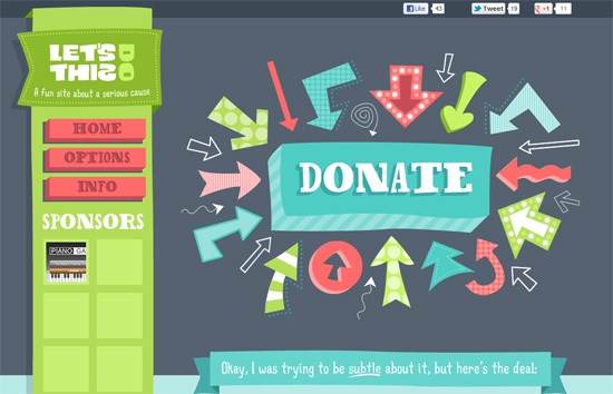
The Let's Do This! website, which asks site visitors to donate to the Susan G. Komen for the Cure organization, presents a good example of how to direct users towards your call to action. The web page is laid out logically so that you can see the primary call to action right away. Using arrows points your eyes to the call to the "Donate" button. The button and the surrounding arrows have high-contrast colors compared to the dark gray background, making sure it stands out.
Relevance
Every visitor comes to your landing page from a specific source. The landing page has to be relevant to that source. For example, if your ad says that by clicking on it, the user can buy iPads for half the price, then your landing page better be selling iPads for half the price. Relevance is key.
Tips:
- Consider creating landing pages for each marketing campaign. For example, if you have a Facebook marketing campaign, create a landing page that caters to Facebook users.
- Customize the landing page depending on the source. Add special content, discount codes and call to actions depending on what site the user is coming from.
Reduce the Risk for Taking Action
Internet users don't like taking risk, that's obvious. We are often concerned about security, privacy and of being scammed.
Tips:
- Offer a compelling guarantee. For example, if you would like the user to buy a product, consider giving them a way to recover their money if they are unsatisfied with their purchase.
- Anticipate any concerns that the user may have and address them. Before taking an action, users may want to know more about the result of that action. These concerns are often related to cost, time and security.
- Offer a free trial (if possible). For example, if the landing page's goal is to ask users to subscribe to one of your paid plans, consider allowing users to try it before they need to provide credit card information.
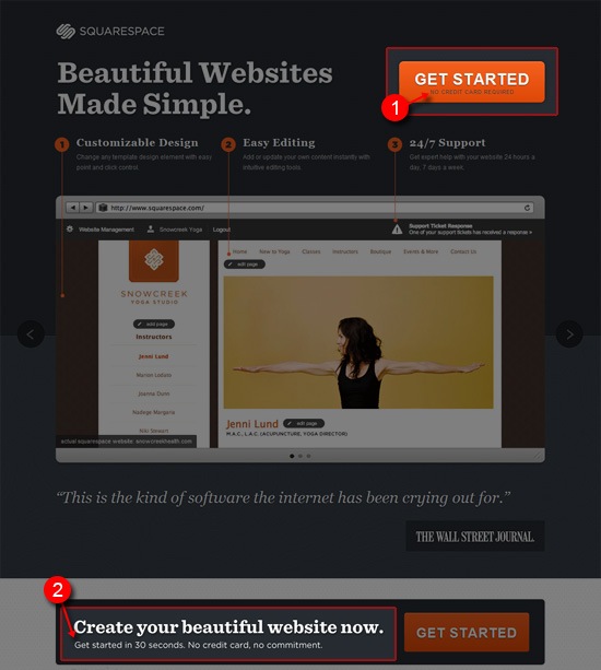
Squarespace displays good examples of reducing the risk to signing up and using their web service. By clearly telling users that no credit card is required, that the signup process only takes 30 seconds, and that there isn't any permanent commitment, they have successfully addressed concerns related to cost, time and security.
Scarcity
One way of designing landing pages that work is by creating a sense of scarcity. If the user feels that the product might run out of stock or that the discounted price might end soon, they may be compelled not to procrastinate and take action now.
Tips:
- Use convincing copy that conveys a sense of urgency. For example, clearly stating that the special discounted price will end soon might urge users to purchase your product now.
- Provide dynamic information that conveys scarcity. For instance, if you're only selling 100 units, on your landing page, display how many units are left whenever someone purchases a unit.
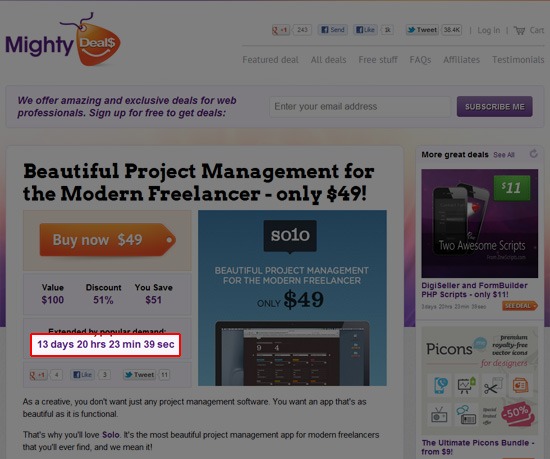
On Mighty Deals, they display a countdown of how long until a deal expires. This may prompt site visitors to buy a deal immediately.
Trust Elements
There are many ways to provide users with reassurance that taking the action being solicited from your landing page is safe and secure.
One way is to provide social proof. Social proof can be in the form of displaying tweets about a product, testimonials from previous buyers, and positive reviews on third-party/non-affiliated sites such as review sites and blogs.
Other ways include displaying certificates and badges from third-party companies.
Tips:
- Provide social proof data from reputable and well-known web services. For example, displaying the number of Facebook Likes is a good way to show social proof.
- Locate trust elements close to the call to action. It's important that the user is able to see these trust elements around your call to action.
- Be honest. It goes without saying: Don't publish fake testimonials and bloated social media follower counts.
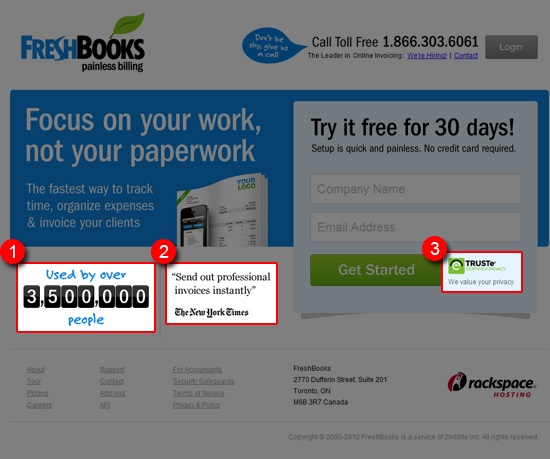
On the FreshBooks landing page, you can see three trust elements: (1) The number of people using their web service, (2) quotes from reputable and well-known sites such as the New York Times and (3) their privacy certification.
Conclusion
The design of landing pages is crucial in prompting users to take your desired action. By following the simple tips mentioned above, you'll be well on your way to creating effective landing pages.
Related Content
- Getting Users to Sign Up: Factors in Design and Content
- Use the 80-20 Rule to Increase Your Website's Effectiveness
- A Look into Registration Buttons in Web Design
- Related categories: Web Design and Web Development
About the Author
 Karol K. (@carlosinho) is in his 20s and is a web 2.0 entrepreneur from Poland who shares his thoughts at newInternetOrder.com. Tune in to his site to get web design tips and content on online-business-related stuff.
Things you can do from here:
- Subscribe to Six Revisions using Google Reader
- Get started using Google Reader to easily keep up with all your favorite sites
Wednesday, March 14, 2012
How not to launch a website
As a developer I've launched hundreds of websites over the years. There are of course many ways to do so, from the grand launch with speeches and presentations, to the quiet 'go live' overnight approach. But practically all involve and benefit from a well-crafted press release.
I say this because I saw a press release (original here) from a regional organisation recently, about a new consumer-oriented portal. The 'consumer-oriented' part is key because you'd expect them to want people to find the site. But nowhere in the press release does it provide the URL to the site. Nor does their own website link to it (even if you search for it). And a wider Google search fails to find it - just the same less-than-useful press release.
So this new website (ironically, it's for the rapid exchange of information!) is to all intent and purposes invisible.
Wednesday, March 7, 2012
Adobe Shadow Simplifies Mobile Web Testing
Sent to you by Steve Mc via Google Reader:
via Webmonkey by Scott Gilbertson on 3/7/12

Adobe Shadow makes it easy to test your site on multiple devices at the same time. Photo: Adobe
To try out Adobe Shadow, head on over to Adobe Labs and grab the desktop app and Chrome browser plugin, along with the Android and iOS offerings.
If you've never tried testing your site simultaneously on multiple devices, the fact that Shadow consist of four separate apps should give you some idea of how difficult it generally is. Thankfully, once you have all the pieces installed, Shadow makes the rest of the testing process as simple as hitting refresh. In fact, much of the time you don't even need to do that — Shadow will automatically mirror whatever you're doing on the desktop to the rest of your connected devices.
Though it's still a beta release, Shadow may well be the most useful thing Adobe has ever built for web developers, particularly those that have embraced responsive design. It's no secret that, while responsive design allows developers to easily target a wide range of screen sizes, it adds a considerable amount of work to the development process. But with Shadow mirroring your website across dozens of devices at the same time, testing becomes simple and easy. It's a bit like synchronized swimming for web browsers. You can even debug and make changes directly in Chrome and then see the results on each device. To get an idea of how Shadow works, check out this overview video from Adobe:
There are two small problems with Shadow. The primary problem is that Shadow will only test your site in WebKit mobile browsers. We'd hate to see Shadow become yet another reason for developers to ignore non-WebKit browsers. So, while Shadow is great, it won't give you the whole picture right now.
The good news is that Shadow is a beta release and a work in progress. I spoke with Bruce Bowman, Senior Product Manager of Shadow and, while he stopped short of committing to anything, Bowman made it clear that Adobe plans to keep expanding Shadow's capabilities as the project progresses.
The other problem with Shadow isn't actually a problem with Shadow directly, but its usefulness is nevertheless directly related to the number of iOS and Android devices you have on hand. Obviously those that will benefit most from Shadow are large web development shops with the budget to invest in dozens of mobile devices. Shadow is no less handy for individual developers with only one or two devices, though the results are of course limited.
Should Shadow prove popular, perhaps it will help spur the sort of device swap gatherings we've heard mobile expert Peter Paul Koch suggest — a group of web developers pool their resources, bring together a wide range of mobile devices and take turns testing websites. Shadow could make that process considerably easier and faster thanks to its live editing capabilities.
Things you can do from here:
- Subscribe to Webmonkey using Google Reader
- Get started using Google Reader to easily keep up with all your favorite sites
Friday, March 2, 2012
Users Expect Websites to Load in the Blink of an Eye
Sent to you by Steve Mc via Google Reader:
via Webmonkey by Scott Gilbertson on 3/2/12

Photo: tobias.munich/Flickr
Think your three-second page loads are "just fine"? Think again.
According to engineers at Google, even the blink of an eye — which takes around 400 milliseconds — is too long.
That's the word from the New York Times, which makes an unusual foray into the world of web development with its article "For Impatient Web Users, an Eye Blink Is Just Too Long to Wait."
Some web developers may remember the days of the two-second rule (and no, not the one that applies to dropping food on the floor). The established wisdom — well-tested at the time by usability experts like Jakob Nielsen and others — was that after two seconds the number of users willing to wait for your page to load dropped off significantly.
That rule still holds, it's just the amount of time that's changed. Nowadays, the Times claims, users drop off after a mere 400 milliseconds, and a difference in page load time of just 250 milliseconds is enough to convey a distinct advantage over your competitors.
It's that last number that's perhaps most interesting. Anyone who's browsing the web via a 3G connection can tell you that if you're only willing to wait 400 milliseconds for a page to load, you aren't going to see much of the web. On mobile networks bandwidth constraints are even more of an issue than they were when the two-second maximum was popularized. Users seem to understand this, but they don't see it as an excuse. Now, perhaps more than ever, slight differences in page load time can give your site a significant advantage over competitors, according to the Google and Microsoft engineers quoted in the Times piece.
In other words, users may still, in some circumstance, be willing a wait a second, but if your competitor's page is even 250 milliseconds faster, you can kiss your users goodbye.
Don't believe us? Head over to the Times article and see if Google's engineers don't convince you. When you're done we've got a few tips on how to speed up your website and make sure that no one has the edge on you. Here are a few helpful articles from the Webmonkey archives:
- A Guide to Understanding Page-Speed Tests — Before you can optimize you need to know what you're looking at.
- Build Faster Mobile Websites With 'Adaptive Images' — Every byte counts in the mobile world, make sure your images aren't slowing down your site.
- Google's New Page Speed Service Promises to Speed Up Your Website — Google's Page Speed tool works just about everywhere and will give you some helpful tips for speeding up your website.
- Speed Up Your WordPress Site With Google's New Page Speed API — WordPress has its own built-in Page Speed tool.
- How to Speed Up Your Site With YSlow and Page Speed — YSlow is slightly different than Google's Page speed, this article offers some tips on how to use each.
- Speed Up Your Website Using CDN JS — External code can be a serious drag on your page loads, make sure you're loading your JavaScript from a CDN.
- Clock Browser Speeds with Webmonkey's Stopwatch — You can never have too many page speed timing tools, this is our older, but still functional, stopwatch for timing websites.
Things you can do from here:
- Subscribe to Webmonkey using Google Reader
- Get started using Google Reader to easily keep up with all your favorite sites
Time to give your Facebook Page a spring clean
Though the new Facebook Page & Timeline layout goes live at the end of March, you can make use of their new layout now to present your brand better.
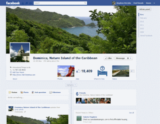

The large image at the top of the page is the 'cover photo', and can be at least 400 pixels wide but ideally 870x360. It is a great way to showcase your brand, be it a destination or a product, and to make an immediate impact on a visitor to your page.
See http://www.facebook.com/help/timeline/cover for more Q&As about the new cover photo feature. Bear in mind Facebook have a few restrictions on the cover photo image: see http://www.facebook.com/help/?faq=276329115767498 .
Subscribe to:
Posts (Atom)